In this boldly graphic painting of sixteen cubes, inspiration came from a project I completed a few years ago during a course on acrylics at the Art Institute of Chicago. We were provided a random image and told to embellish it some way.
I was given a picture of a margarine box from a vintage magazine. I glued the picture to a board and simply added some three-dimensional rectangles to the box to create some kind of pop-art image, seen here.
In “Block Party”, I carried forward the box idea by using different shades of a specific hue for each of the sixteen cubes. The painting was made on a 30” x 30” stretched canvas.
The trick was achieving the right shades of dark and light to make the cubes appear three dimensional. Contributing to the bold effect of the overall image are the highly-defined hard edges of the individual cubes. I achieved this by using special masking techniques to avoid bleeding along the edges.
Although I wanted bright colors, I avoided using what I call “Lego” colors. Instead, the colors are all mixed to achieve somewhat muted hues. The overall effect is intended to be harmonious and instill a sense of cheerfulness.
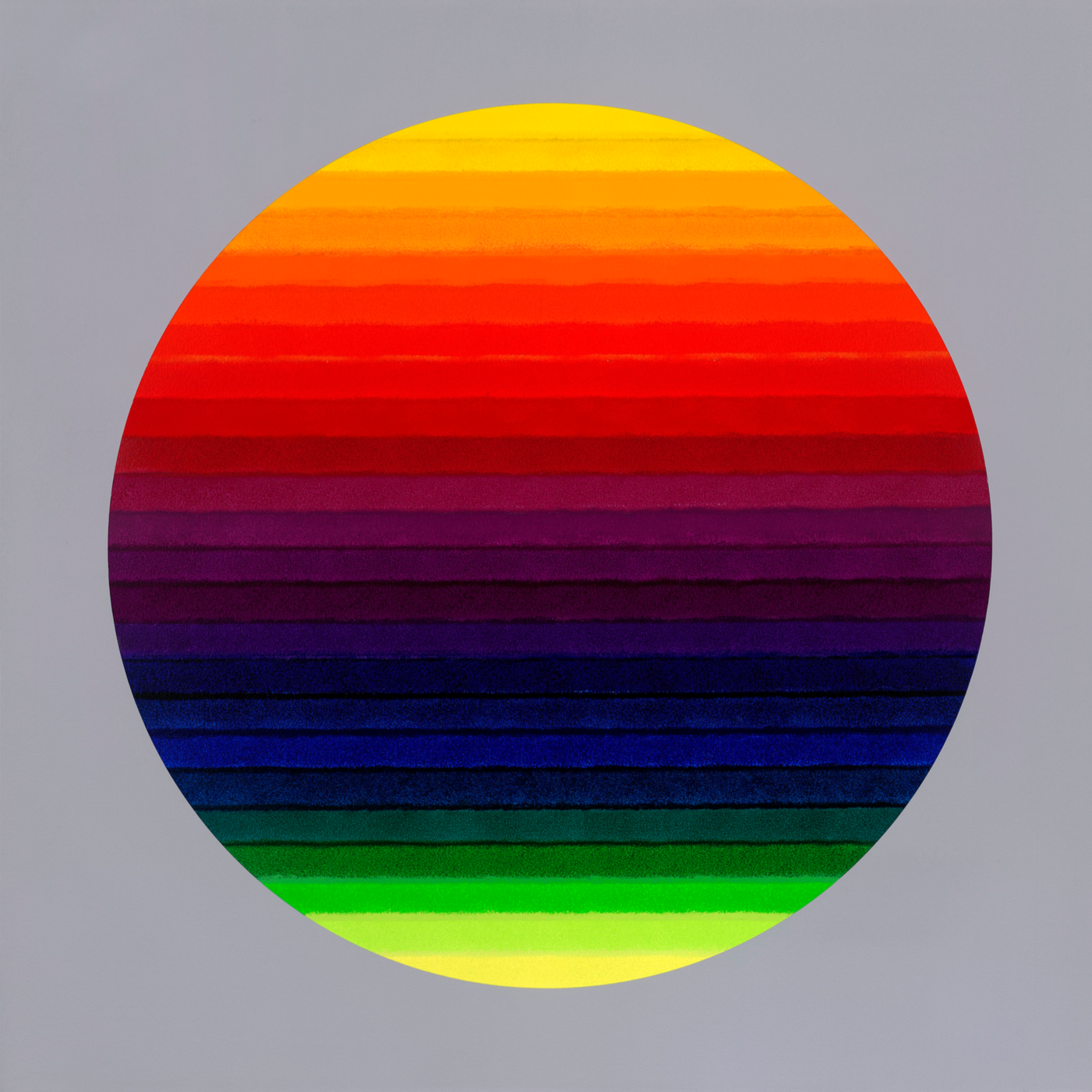
Created as an experiment of sorts; Luminescence is a sphere of saturated hues from the entire color circle, set in a linear format on a gray background. The use of this muted background adds radiance to the individual colors and to the overall effect.
Contributing to the painting’s effect is the juxtaposing of the precise hard-edge circle with the softly blended shades. I achieved this by masking the circle and then using a roller for the individual colors. This creates an interesting effect, whereby the overlapping of colors serves to create different blending effects.
I placed the light colors of the spectrum at the top and bottom of the circle. At the top is a reddish-shade yellow, and at bottom is a greenish-shade yellow. The remaining color hues are found in between.
This creates, in my mind, the illusion of a back-lit image, which radiates the color hues. Thus, the name “Luminescence”. Viewers are drawn to this image, and it is interesting for me to hear their interpretation of the painting. In any case, the painting appears to elicit a feeling of joyfulness and optimism.
This painting, completed in December 2024, represents a style that is sometimes appropriately referred to a “dot” painting. However, dot paintings are not all alike. There are aspects of “Spot On” which sets it apart from other seemingly similar paintings.
Typically, dot paintings are painted on a white background. I decided to use a gray background, which adds intensity to the lighter hues. However, painting a color, especially a light color, on a gray background causes the color to be dull, even with multiple layers of paint.
Using this background color thus creates technical difficulties. The individual circles are actually not painted on gray, but instead are all painted on a white underground. This makes the masking for the individual circles very challenging. The individual circles have extremely highly-defined borders.
This is a trademark of my work, and it creates a sharp and vibrant image. Altogether, there are sixty-four different colors contained in the painting. Although there are a few similar hues, they are all unique.
In my inventory of self-mixed colors, for example, I have over one hundred different blue hues and shades. I once read that the average human being can differentiate between approx. 50,000 different colors and shades - amazing!
What I tried to do with “Spot On” was to mix light and dark hues and color intensities such that one’s eye is kept moving around the painting. I think I was successful, since viewers of the painting often state that they see the colors dancing or moving around. Mission accomplished!
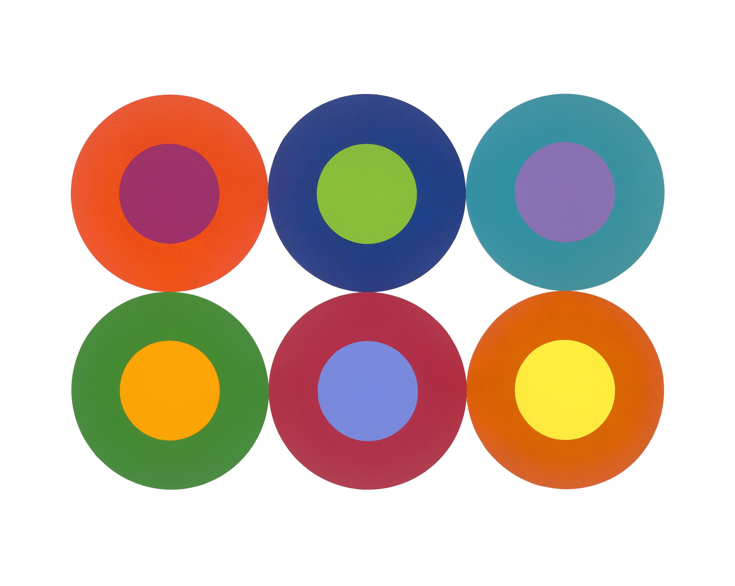
At first glance, “Inner Circle” appears to be a simple work. And it is, I suppose. Fans of my paintings and prints know that I like to experiment with circles (and squares – my partner says I get excited whenever I see a right angle… Maybe a little exaggerated?)
This painting is rather bold due partly to its form. Having six circles in a very structured arrangement taking up essentially the entire painting is somewhat striking. Having circles inside of circles creates some visual activity, which adds to the interest of the work. But these features alone do not necessarily make the painting attractive.
The secret of “Inner Circle” lies in its color contrasts and harmony. For each outer and inner circle, I chose two colors from the so-called color wheel. Had I chosen completely opposite colors for an outer and inner circle, such as pure red and green, this would have resulted in clashing hues which are not pleasant to eye or the brain.
Instead of choosing colors that are 180 degrees opposite on the color wheel, I chose colors that were roughly 120 degrees apart. Accordingly, the colors represent contrasting hues, but they are not diametrically opposed. I then put six of those combinations into the six-circle configuration.
Amazingly, (and there is always an element of surprise on my part), the resulting image is somehow very harmonious. Many viewers find this to be a very friendly and warm piece, and they acquire prints for their children’s bedrooms, for example. But adults also find the painting attractive and buy prints in all sizes, large and small. That’s the rewarding part of this business.
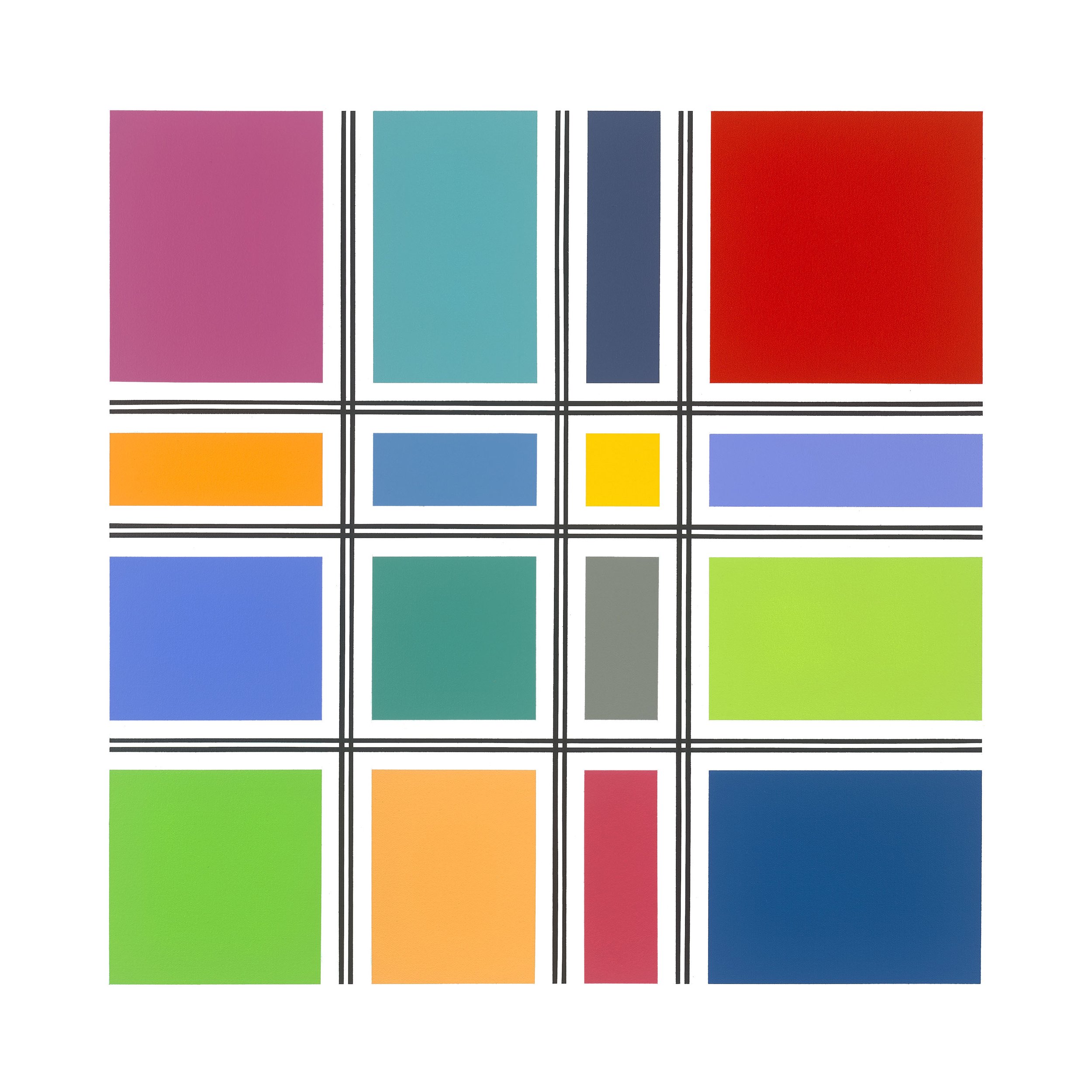
This piece, completed in December 2024, is a minimalist depiction of sixteen different-sized color rectangles in a grid pattern. The rectangles represent a combination of different hues, some approaching pure colors and others being muted mixtures of colors.
The colored rectangles are separated by two thin black lines forming the grid. This piece is intended to create a juxtaposition between the harmonious colors, on the hand, and the rather severe black lines separating them.
When viewing the painting, one is drawn to the colors, since these cover the most of surface of the work. At the same time, the black lines are visually inescapable due to their clear structure and strong expression. This creates a feeling of movement and draws the observer to the image. The overall effect is an engaging geometric abstraction.
And here’s something technical:
As an added feature of the work, the perpendicular intersecting of double black lines produces what’s referred to as the “Herman Grid Illusion” (the scientific name for this is “lateral inhibition”). When viewing the painting from certain distances, there is an illusion of grey blobs at the intersections of the black lines.
This is a contrast effect that is a caused by a complicated neurological process. One doesn’t see the grey spots when focusing on the intersections, but only in the surrounding area, i.e. in one’s peripheral vision. This causes the eye to essentially “chase” the grey spots, adding to the perceived visual motion of the image.